





Redesigning Zain Cash, the wallet most of Jordan already uses.
A conversion-first website for a mobile wallet with over a million users. Arabic-first information scent, clearer messaging, and faster pages.
اقرأ هذه المقالة بالعربية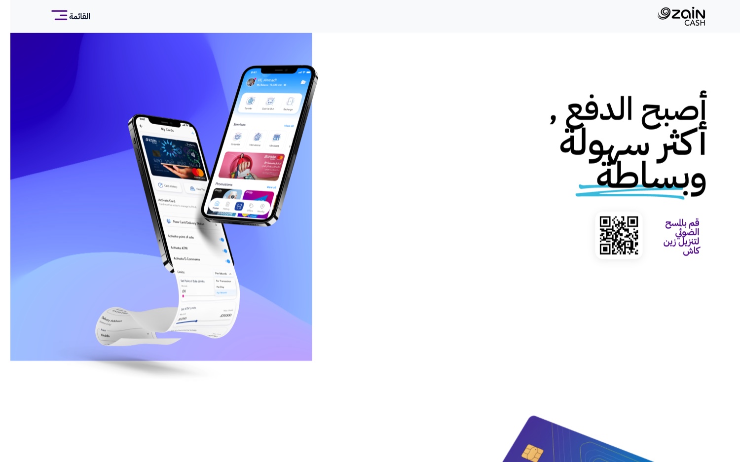
The redesigned homepage. Arabic-first, conversion-led.
Zain Cash is a mobile wallet and payments app in Jordan. It is built by Zain, regulated by the Central Bank of Jordan, and used by more than a million people to send money, pay, top up, manage cards, and buy vouchers. More than 430,000 of them use Zain Cash cards. When a product is that embedded in daily life, the website is not a brochure. It is the front door.
So the redesign was not about decoration. It was about conversion. People land to download the app, request a card, or understand a feature, and the page has to get them there fast, on a phone, usually reading right to left. Here is how we rebuilt it, and the three ideas it stands on.
Key takeaways
- Zain Cash is a mobile wallet used by more than a million people in Jordan, regulated by the Central Bank of Jordan, with over 430,000 on its cards.
- When a product is that embedded in daily life, its website is the front door, not a brochure.
- We rebuilt around three ideas: Arabic-first information scent, clearer messaging, and faster pages.
- Speed is conversion. Google found 53 percent of mobile visits are abandoned when a page takes over three seconds to load.
- Lead with the outcome and the proof. At this scale, the user numbers are their own argument for trust.
Why does a wallet this big need a website redesign?
Because the website is where new users decide. Zain Cash is already woven into daily life in Jordan, used by more than a million people to send money, pay, top up, manage cards, and buy vouchers, with over 430,000 on its cards. At that scale the site is not marketing around the product. It is the front door to it.
When the front door is the first impression for everyone who has not downloaded yet, it carries real weight. It has to convert a curious visitor into a cardholder, explain a growing service plainly, and load fast enough that nobody leaves before it does. That is a product problem, not a brochure.
What was the brief?
Keep pace with a service that never stops shipping, and still convert. Zain Cash kept adding cards, payment methods, and partners, and the website had to keep up without turning into a cluttered list. Every visitor arrived with a job: download the app, request a card, or understand whether a feature fit their life.
The constraint that shaped everything was the reader. Most of the traffic is mobile, in Arabic, with short patience. The page had to deliver the answer fast, in the reading direction people actually use, or lose them before the value ever landed.
Three ideas behind the redesign
Arabic-first information scent, clearer messaging, and faster pages. Information scent is the trail of cues that tells a reader the next step is this way. Designed Arabic-first, the page puts those cues where a right-to-left reader expects them, so scanning feels natural instead of translated. Then each section was cut to say one thing and say it plainly, because a page that says everything says nothing.
The third idea was speed, and it is not cosmetic. Google found that 53 percent of mobile visits are abandoned when a page takes longer than three seconds to load. For a wallet whose audience is mostly on phones, a slow page is a closed door, so faster pages were part of the conversion work, not a finishing touch.
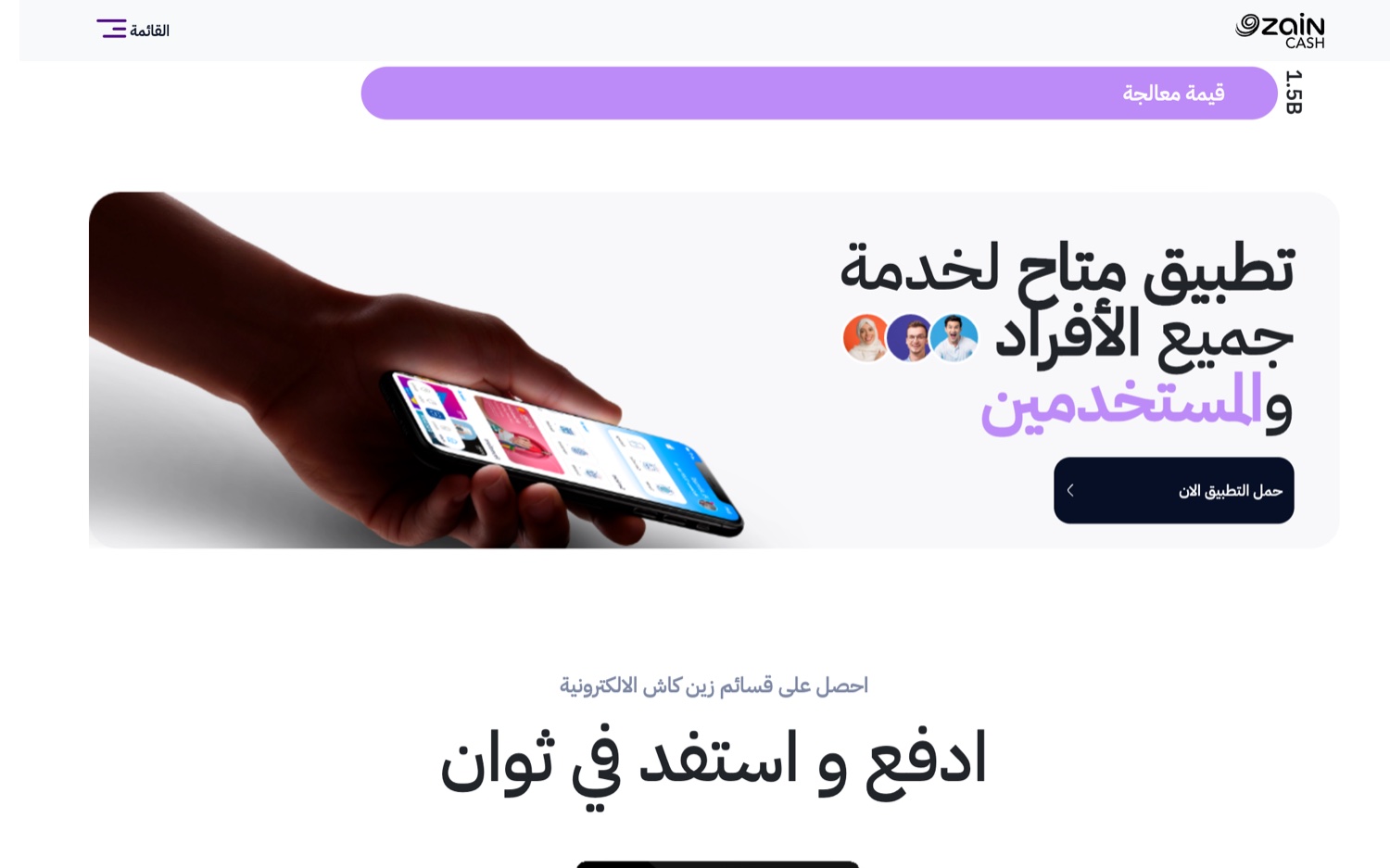
The feature set as a scannable grid. One thing per section.
Designing the path to get your card
The redesign carries the real product, starting with the job most visitors came for. Get your card now, with the card options laid out instead of buried. The feature set reads as a scannable grid: prepaid cards, contactless payments, rewards, manage cards in the app, shop and pay online. A QR payment flow, an NFC sticker, wearable payments, and the voucher catalogue each get room to breathe.
Laying the options out instead of hiding them behind a menu is the whole point. The person who came to request a card should see it immediately, not hunt for it. Every step removed between the visitor and the card is a step that no longer loses them.
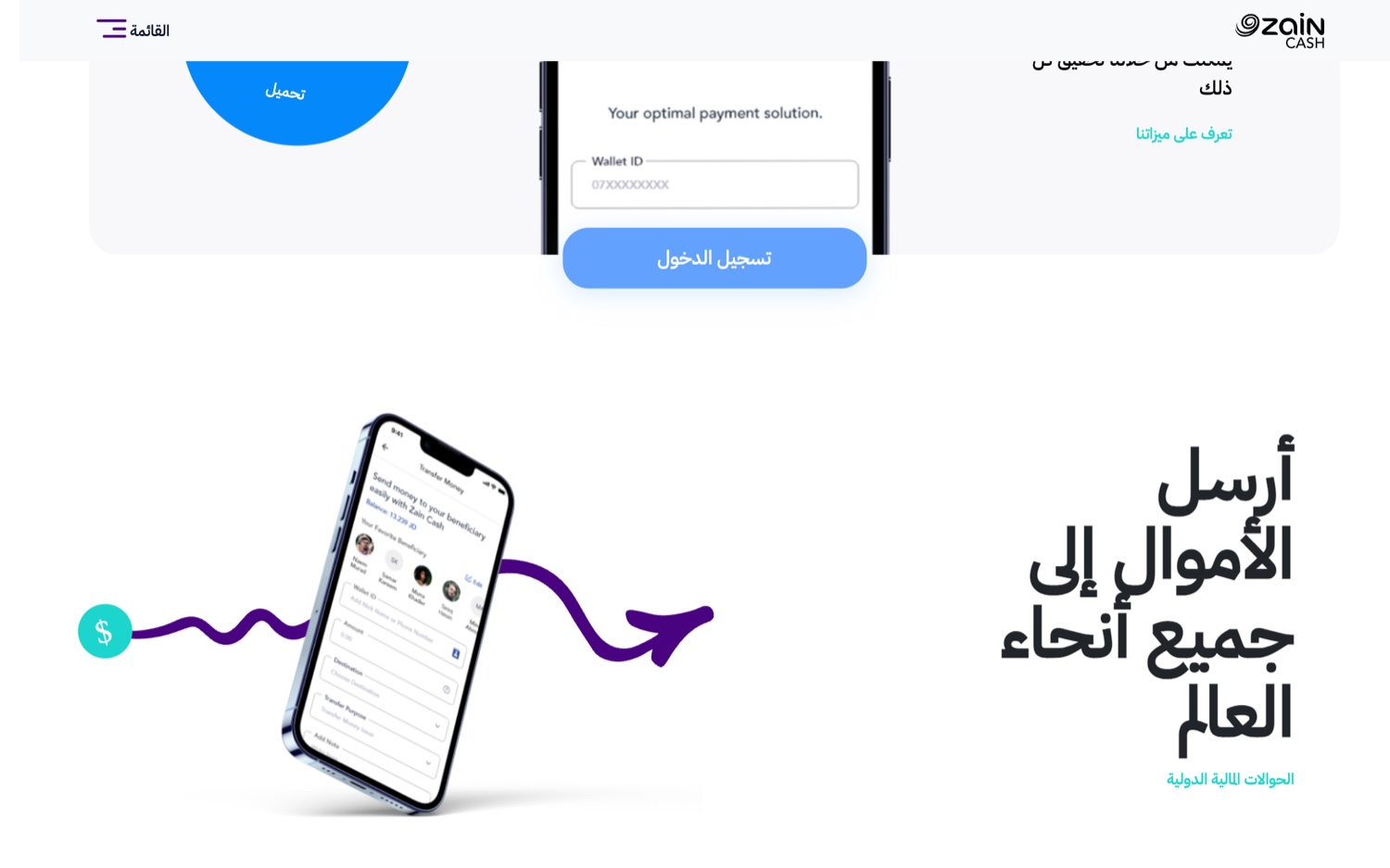
Get your card now. The options laid out, not buried.
Why lead with the numbers?
Because at this scale, the numbers are the argument. The page leads with the figures that matter, more than 430,000 people using Zain Cash cards and over a million on the wallet, because trust at that size sells better than any tagline. A new visitor deciding whether to hand a wallet their money wants to know other people already did.
Proof at the top reframes everything below it. The reader stops asking whether Zain Cash is real and starts asking which card is right for them, which is exactly the question the rest of the page is built to answer.
The result
A calmer, faster journey. A visitor can search, find, and act without friction, and the brand reads as the established financial product it is, not a startup asking for a chance. You can see it live at zaincash.com.
My role was UX and product design, on the wallet experience and the surfaces that carry it, with the Branders team. The thinking underneath it, designing for the outcome rather than the feature, is the same lens I bring to every product. If you have one that needs it, tell me what you are building.
FAQ
What is Zain Cash?
Zain Cash is a mobile wallet and payments app in Jordan, built by Zain and regulated by the Central Bank of Jordan. More than a million people use it to send money, pay, top up, manage cards, and buy vouchers.
What did the Zain Cash website redesign focus on?
A conversion-first site built on three ideas: Arabic-first information scent, clearer messaging, and faster pages, so a visitor could download the app, request a card, or understand a feature without friction.
Why does page speed matter for a wallet website?
Most of the traffic is mobile, and Google found that 53 percent of mobile visits are abandoned when a page takes longer than three seconds to load, so speed is part of conversion rather than a nicety.